It is tempting to treat colour psychology as a set of slogans: yellow makes people happy, blue makes them calm and grey makes them sad. The research on colour and mood is both more convincing and more complicated than those claims.
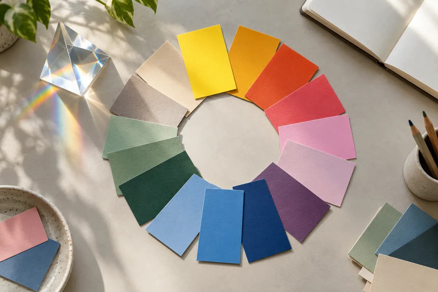
A systematic review covering 128 years of peer-reviewed research found recurring correspondences between colour categories and emotions. Yellow, green, blue, pink, white, light and saturated colours were more often linked with positive associations. Grey, brown, black and dark colours were more often linked with negative associations.
Grey was frequently associated with sadness, boredom, tiredness and low power. Saturated colours corresponded more often with positive, higher-arousal emotions.
Read the open-access systematic review
Association is not treatment
Much of this research asks people to connect colours with emotional concepts. That can reveal stable cultural and perceptual patterns, but it does not automatically show that exposure to a colour will cause the matching feeling.
Context matters. A red warning light, red flower and red childhood bedroom do not carry the same meaning. Lightness and saturation can matter as much as hue. Culture and personal memory also influence interpretation.
This is why claims that a particular wall colour will cure anxiety or make a team more productive should be treated cautiously.
What we can reasonably say
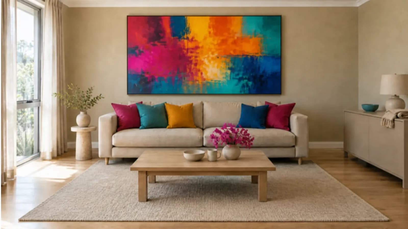
Colour contributes to atmosphere. People use it to interpret places, objects and identities. A completely desaturated environment communicates something, even when its designer calls it neutral.
Bringing colour back is therefore not a medical prescription. It is an invitation to create environments with more visual variety, identity and possibility—and to pay attention to how those environments feel to the people using them.


Join the conversation
Keep it constructive, curious and kind. Comments are moderated before appearing.
No published comments yet. Start the conversation.