
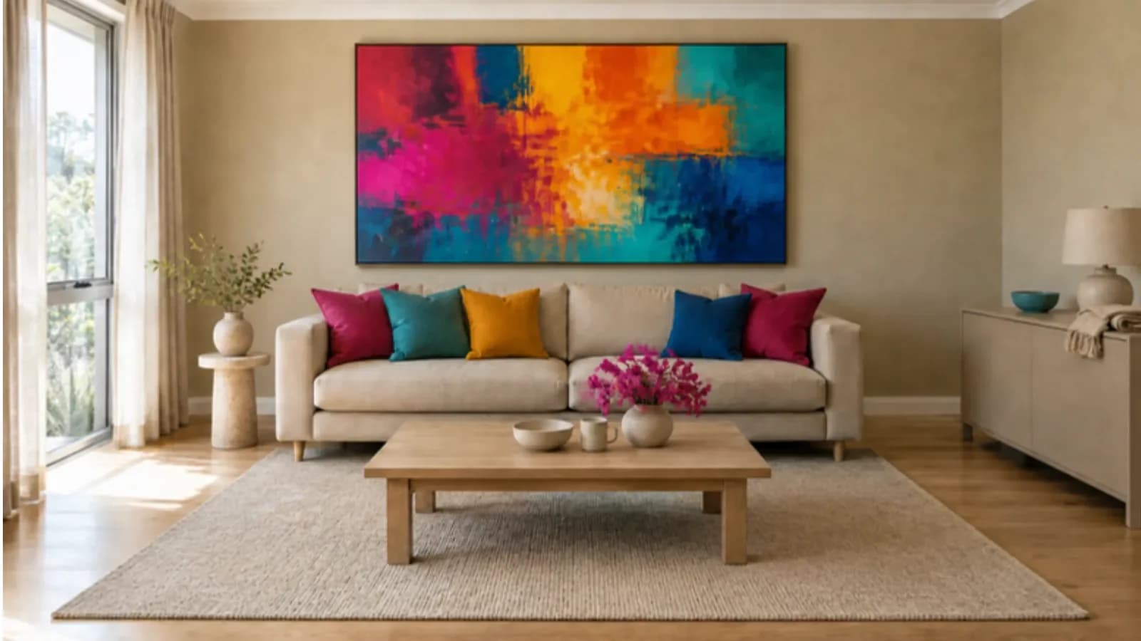
Colour drenching is one of those interior phrases that sounds more complicated than it is. In plain terms, it means flooding a room with one colour — not only on a single feature wall, but across the surfaces you see together, so the space feels wrapped in the same hue.
Done well, it can make a room feel considered, cocooning or surprisingly calm. Done in a hurry, it can make a space feel smaller or darker than you expected. The good news is that you can try the idea gently, including in a rental, without painting every architrave in the house.
What colour drenching usually involves
In a painted room, a full colour drench often includes the walls, the ceiling, the skirting and the window frames or architraves, all in the same colour or in very closely related shades. Some people take it further, onto built-in joinery, a door, or even a piece of furniture.
The point of covering those edges is to reduce the usual contrast between “the wall colour” and “the white bits”. When the trim is no longer a bright white outline, the eye reads one atmosphere rather than a collection of surfaces.
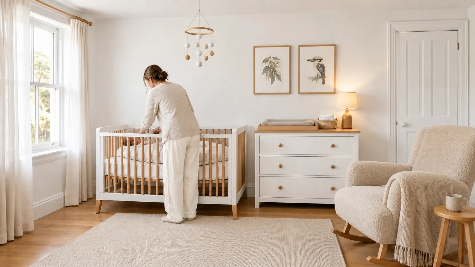
Before: plain white walls, ceiling and trim.
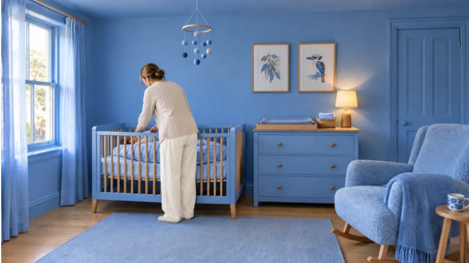
After: walls, ceiling and trim all in one cornflower blue.
You do not have to do the full version. A softer drench might be the walls and trim only, with the ceiling left paler. A still gentler version, which we will come to, uses no new paint at all: it repeats one colour around the room in things you can move.
None of this is a rulebook. It is a way of making a colour feel intentional.
Why people like it, and what it cannot promise
A colour-drenched room can feel richer than a pale box with one bright cushion. The colour becomes the setting, not a decoration perched on top. In a small room, such as a study, a powder room or a reading corner, that all-over approach can be especially effective, because you are not asking a timid accent to do all the work.
It is also fair to say that colour changes how a room feels. People often reach for warmer, deeper or brighter shades because they want a space to seem cosier, livelier or more like themselves. That is a good reason to experiment. It is not a guarantee. As we have written in Colour and emotion: what the science actually says, colour carries associations, but it is not a treatment, and context matters. A green study and a green hospital corridor are not the same experience.
Choose a colour because you enjoy living with it, not because a slogan promised it would change your mood.
How to choose a colour for a drench
Live with samples in the actual room. A shade that looks gently earthy on a chip can become much stronger when it is on every wall, and stronger again if it also goes on the ceiling.
- Paint samples onto large cards, not only the wall in a tiny patch.
- Move them around: a dark corner, a wall that gets afternoon sun, a spot opposite the window, and the same places after dark.
- Look at the colour next to your floor, your curtains and the furniture that will stay.
- If you can, leave the samples up for a few days. The colour you still like on Thursday morning is more useful than the one that excited you in the shop.
In much of Australia, and certainly in a bright Queensland room, daylight can be strong. A saturated colour may look joyful in the morning and a little intense at noon. That does not mean you should avoid it. It means you should test it. A slightly softer or more muted version of the same idea is sometimes easier to live with in a sunlit space, while a deeper version may suit a room that is already shady.
If you are choosing paint, use a product suited to each surface — wall, ceiling, trim, or a moisture-prone room — and follow the preparation instructions. If you rent or share a building, get permission before you open a tin.
A practical way to try it if you can paint
You do not need to start with the main living room.
A cupboard interior, an alcove, a small toilet, a study or the inside of a door is a more forgiving first project. Our low-risk ways to add colour article is useful here: paint one contained area first, try a sample, and think about how easy the change would be to undo. The 30-ideas guide also suggests testing paint on movable card, and starting inside a cupboard if you want a private experiment.
If you like the result and you are allowed to go further:
- Decide whether the ceiling will join the drench, or stay lighter.
- Decide whether trim will be the same colour, a touch lighter, or a touch deeper. Same-colour trim is the classic drench.
- Prepare the surfaces properly. Drenching makes patchy preparation more obvious, because there is no white frame to distract the eye.
- Keep a labelled tin, and a note of the colour, for later touch-ups.
- Once the paint is dry, add your textiles and objects. You may need fewer accents than usual, because the room is already doing a lot of the colour work.
If the finished room feels heavier than you wanted, you can often lift it with a paler rug, a lighter lampshade, clearer curtains, or by leaving the ceiling brighter than the walls. You can also stop at the walls and trim and call that enough.
A rental-safe, no-paint version
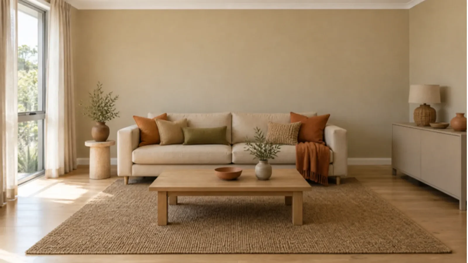
Before: warm earthy tones.
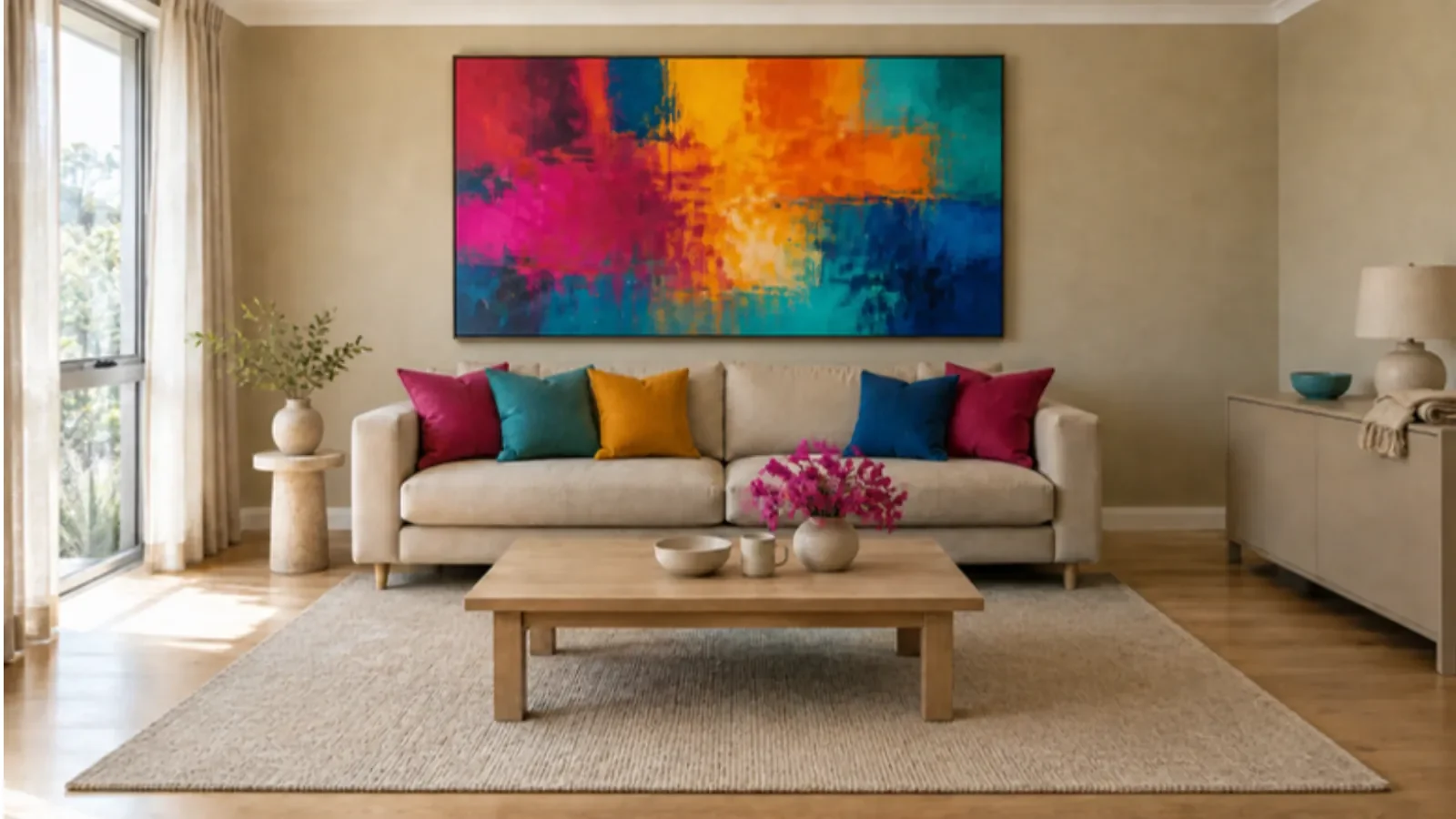
After: the same room with a bold painting and cushions that repeat its colours.
If you cannot paint — or do not want to — you can still borrow the idea. The trick is repetition. When one colour turns up again and again, the eye starts to read the room as immersed in that hue, even if the walls stay magnolia.
Try this in a living room, bedroom or even a rental kitchen:
- Choose one colour you already like, in a strength you can live with every day.
- Repeat it across several things you control: a rug, cushion covers, a throw, a lampshade, a piece of art, a vase, a blanket at the end of the bed, even a set of mugs or a tablecloth.
- Keep most of those items in the same colour family, rather than mixing six competing brights, so it feels like a drench and not a jumble.
- Let the existing pale walls act as a pause, or cover more of them with a large artwork, a bookcase you own, or curtains, if that is allowed.
You can go surprisingly far with this. A rust-coloured rug, rust cushions, a rust lampshade and a rust-toned print will change a beige rental more than a single feature cushion ever will. When you move, the “drench” packs into the car with you.
If you are tempted by stick-on wallpaper or coloured film as a shortcut, be careful. Some products can mark, stain or lift paint when they come off, even when they are described as removable. Test anything adhesive in a hidden spot, follow the instructions, and get permission if your lease requires it. A fabric you can fold is usually a kinder experiment.
For colourful objects, textiles and finishes you might not find in a standard department-store range, have a look at Colour Partners, our directory of Australian makers and shops.
A few things that help a drench feel good to live with
- Light first. Walk around the room at breakfast and in the evening before you commit.
- One main colour is enough. A close cousin of the same shade can add depth. A lot of extra colours can weaken the effect.
- Texture helps. A matte wall, a woven rug, a linen curtain and a glossy lamp base can keep a single colour from feeling flat.
- Leave room to see it. A colour-drenched room still needs somewhere for the eye to rest: a pale floor, a clear window, a simple chair, a bit of uncluttered wall.
Colour drenching is not a test of bravery. It is a way of taking one colour seriously enough to let it fill the space. Start with a cupboard, a corner or a collection of textiles. If it feels like you, you can always take the next step.
Join the conversation
Keep it constructive, curious and kind. Comments are moderated before appearing.
No published comments yet. Start the conversation.